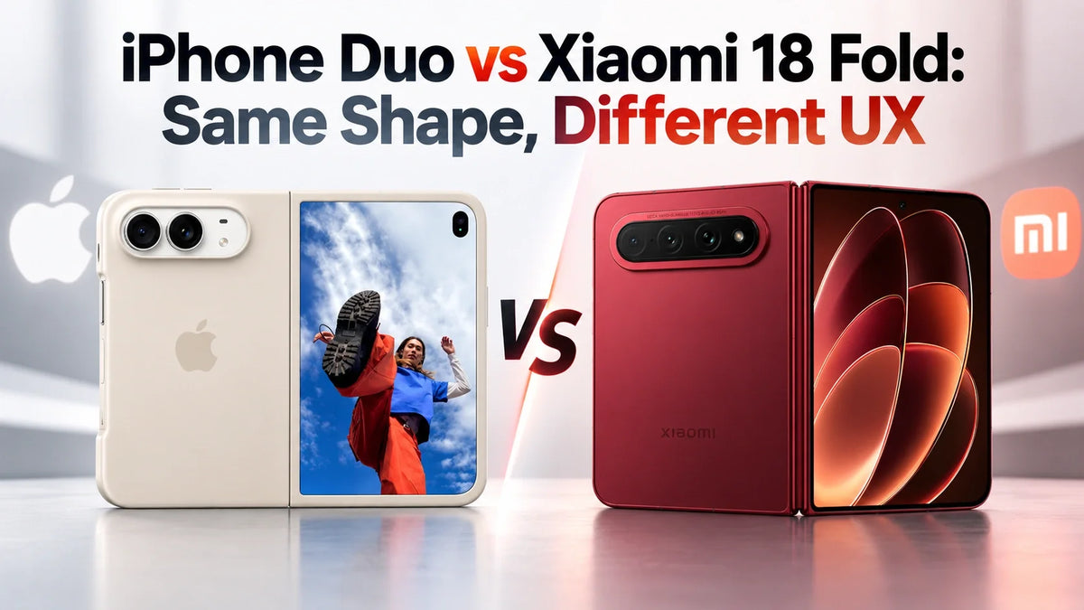
iPhone Duo and Xiaomi 18 Fold may share almost the same physical idea, but they do not deliver the same software experience. Xiaomi learned the visible language: the D-shaped outer screen, the compact half-width form and even a glass-like transition effect. Apple went further. On iPhone Duo, the outer screen is treated as a logical continuation of the right half of the open display, while the Dock, status information and key controls remain spatially stable. That is why Apple’s transition feels coherent rather than merely animated.
iPhone Duo and Xiaomi 18 Fold Look Almost Identical
Put the iPhone Duo and Xiaomi 18 Fold side by side and the resemblance is impossible to miss. Both use a book-style folding body, a compact outer display on one half and a larger display inside. From the front, each cover screen can read like a capital “D”: straight beside the hinge and rounded along the outer edge.
That similarity naturally creates the question: Did Apple copy Xiaomi, or did Xiaomi copy Apple? But arguing from announcement dates misses the most important point.
Modern flagship phones are developed years before they reach stores. Their display proportions, hinge architecture, batteries, antennas, software layouts and accessory dimensions are decided long before a public launch. The first company to announce a similar silhouette is not automatically the company that invented the complete experience.
The more revealing question is this: which company understood what this shape is supposed to do?
Two displays designed as one system
Apple describes iPhone Duo as a dual-display system with a 7.6-inch inner display and a 5.4-inch outer display. It says the aspect ratio is consistent across both screens and that transitions between displays and orientations are seamless.
Nearly matching screen sizes
Xiaomi lists a 7.58-inch inner display and a 5.38-inch outer display for Xiaomi 18 Fold, while promoting an “inner-and-outer consistent” flagship display experience.
Apple starts with interaction
The iPhone Duo cover screen is designed to correspond visually with the right-hand region of the unfolded interface. Closing the phone therefore feels like folding the same workspace, not switching to a second unrelated device.
Xiaomi reproduces the surface
Xiaomi reaches a closely related physical form, but the visible animation is not the whole idea. Without the same spatial relationship between screens, the effect can look similar while feeling less natural in use.
Why Does iPhone Duo Have a D-Shaped Outer Screen?
The D-shaped iPhone Duo cover display makes more sense when you stop treating it as a decorative front screen.
Open the phone and the inner display forms a rounded rectangle with four curved corners. Fold that canvas through the center. The right side becomes a half-width visual region with a straight boundary at the hinge and rounded corners at the exposed edge—the same basic geometry suggested by the outer display.
The inner and outer panels are physically separate screens. Apple is not literally bending the same OLED pixels around the device. The continuity comes from mapping the interface so that the cover screen feels spatially related to the right side of the open canvas.
That distinction matters. A conventional foldable can simply resize an app from a tablet-like layout into a narrow phone layout. Apple’s apparent ambition is more specific: preserve the user’s sense of where the content and controls are while the device changes shape.
A folded half, not a miniature tablet
The straight hinge edge and rounded outer edge visually connect the closed display with one half of the open display.
Designed for one hand
Apple says that in the closed state, essential controls move to the side for easier reach. That is especially important on a short, compact 5.4-inch cover screen.
Stable visual anchors
Keeping navigation, Dock and status information toward the right creates stable reference points. The phone can change shape without making the whole interface appear to jump somewhere else.
Closing feels less disruptive
The content may reflow, but its scale, hierarchy and primary controls can remain familiar enough that the transition feels continuous.
The Real iPhone Duo Trick Is Not the Folding Animation
Xiaomi and some third-party foldable concepts focus on the most visible part of Apple’s transition: a soft zoom, translucent layers or a glass-like blur as the device opens and closes.
That can imitate the surface style. It does not necessarily reproduce the interaction.
The essential idea is spatial continuity. If the outer screen represents the right-hand zone of the larger interface, important elements should not travel unpredictably across the canvas during the transition. The Dock, status information and common controls become anchors. Content can expand into the newly available left side while the user’s main point of reference remains stable.
This is why Xiaomi can reproduce a beautiful blur effect and still miss the essence. If an app recenters every element, changes scale abruptly, shifts the Dock, loses scroll position or rebuilds the page after unfolding, the animation is only decoration covering a discontinuity.
In other words, the glass effect is the polish. The layout relationship is the product. Apple designed that relationship first; Xiaomi appears to have learned the part that is easiest to see.
Copying the Shape Is Easier Than Copying the Logic
It is relatively easy to recognize the visible ingredients of the iPhone Duo design: two rigid halves, a central hinge, a short D-shaped cover screen and a larger rounded display inside.
A manufacturer can reproduce those proportions. A software team can also add a zoom, blur or translucent layer to make the opening animation look more polished. But those are the parts users can see in a five-second demo. They are not the deepest part of Apple’s solution.
The official dimensions make the resemblance even stronger. Apple uses 7.6-inch and 5.4-inch displays, while Xiaomi uses a nearly identical 7.58-inch and 5.38-inch pairing. Xiaomi clearly understands the physical appeal of the half-canvas form.
Where Apple separates itself is the relationship between that hardware and the interface. iOS 27 does not merely shrink the large screen into the outer screen. It treats the right side as the stable part of the composition and uses the newly available left side when the phone opens.
This means the physical fold and the software layout tell the same story. On Xiaomi 18 Fold, the hardware can look remarkably close, yet a transition that mainly relies on visual effects still feels like one screen being replaced by another. It learns Apple’s visual vocabulary without fully reproducing its grammar.
Continuity is the starting point
- Consistent inner-to-outer aspect ratio
- The outer screen maps to the right-side visual zone
- Dock and status information remain stable anchors
- Reimagined iOS 27 layouts for multiple poses
The physical idea comes first
- 5.38-inch outer and 7.58-inch inner displays
- A very similar D-shaped cover-screen geometry
- Visible blur and transition effects can mimic Apple’s polish
- The spatial link between the two layouts is less complete
What Foldable App Developers Often Miss
An iPhone Duo app does not become well adapted merely because it stretches to fill 7.6 inches or adds a fashionable opening animation.
Preserve the user’s exact state
Keep the same document, video position, selected item, draft text and scroll location when the display changes.
Give controls a stable home
Primary navigation should remain predictable instead of jumping from one side to another as the layout expands.
Add space without replacing context
The unfolded view can reveal a sidebar, detail pane or second app while keeping the original focal content recognizable.
Test more than the ideal demo
Games, camera apps, video players and fixed-aspect-ratio tools may not map one-to-one. They still need deliberate behavior rather than a forced stretch.
This is where Apple’s iPhone Duo design philosophy becomes more interesting than the physical resemblance to Xiaomi. The goal is not to make every screen identical. It is to make every transition understandable.
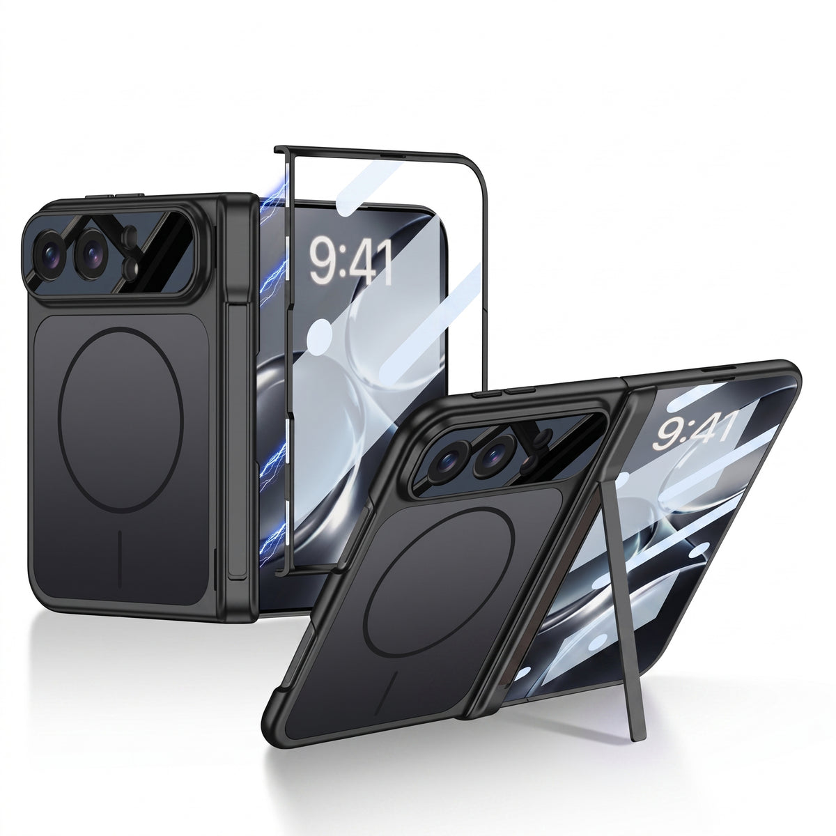
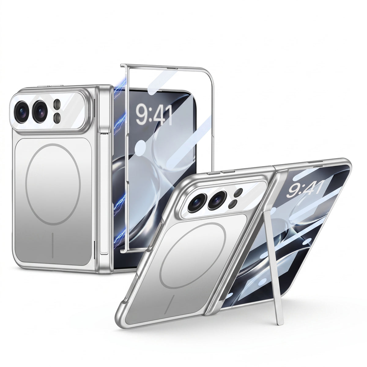
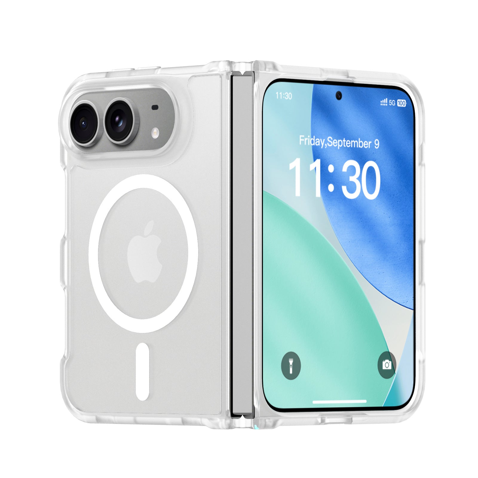
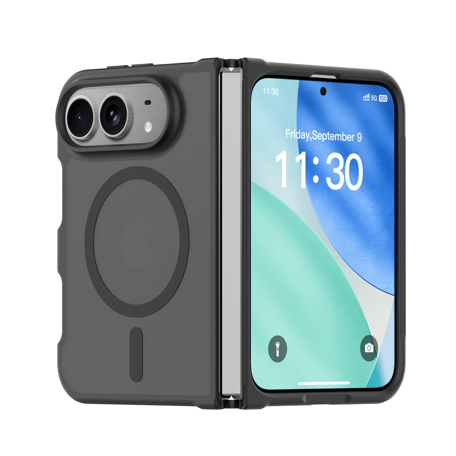
Why the D-Shaped Screen Changes iPhone Duo Case Design
The unusual cover screen also creates new accessory requirements. An iPhone Duo case needs a secure outer-screen frame without covering the curved display edge or interfering with edge gestures. The hinge area needs protection without preventing the phone from opening fully.
Raised borders must be carefully balanced. Too little height leaves the outer display exposed; too much can make swipes near the straight hinge-side edge frustrating. A built-in screen protector must also preserve touch response and fit the D-shaped opening precisely.
MagSafe alignment matters just as much. A foldable iPhone has less uninterrupted internal space than a conventional slab phone, so buyers should use accessories designed around the final iPhone Duo magnetic charging position rather than assuming every generic foldable mount or case will fit.
The Difference Is Not Who Released First
Trying to settle this comparison with a launch timeline is a distraction. A phone can reach the stage first and still understand the experience less completely.
Xiaomi 18 Fold has an outer shape and screen pairing that look remarkably close to iPhone Duo. From that perspective, Xiaomi has captured the skin of the idea. Apple, however, designed the software around what happens before, during and after the fold.
The D-shaped iPhone Duo outer display is a physical expression of a software idea. The cover screen corresponds with the right side of the open layout. The Dock, status information and primary controls stay near the same visual zone. Opening the phone adds space to the left instead of rebuilding the entire interface around a new center.
That is why iPhone Duo feels smoother. Apple is not simply animating a switch between two displays; it is preserving the user’s mental map while the device changes shape.
Xiaomi learned the look. Apple designed the behavior. That is the real difference between these two foldable phones.
iPhone Duo vs Xiaomi 18 Fold FAQ
Did Apple copy the Xiaomi 18 Fold?
Release order does not answer that question because both products were developed long before launch. The more important difference is that Apple connects the iPhone Duo’s physical shape to a deeper inner-to-outer software system, while Xiaomi’s similarity is strongest at the visible hardware and animation level.
Why is the iPhone Duo outer screen D-shaped?
The shape visually matches a half-width region of the open inner display: straight near the hinge and rounded along the outside. That geometry can make inner-to-outer display transitions feel more continuous.
Is the iPhone Duo outer screen the same panel as half of the inner screen?
No. They are separate physical displays. The connection is created through related proportions, interface placement and software continuity rather than shared pixels.
Are iPhone Duo and Xiaomi 18 Fold the same size?
They are extremely close in display size, not identical. Apple lists 7.6-inch inner and 5.4-inch outer displays; Xiaomi lists 7.58-inch inner and 5.38-inch outer displays.
What makes a foldable transition feel seamless?
The app should preserve content, scroll position, playback and input while keeping navigation visually stable. Blur and zoom effects can improve polish, but they cannot replace layout continuity.
Will every iPhone app transition perfectly on iPhone Duo?
Not necessarily. Apps with fixed aspect ratios, custom interfaces or limited large-screen support may need developer updates. Even when a layout cannot remain one-to-one, stable navigation and preserved app state can reduce disruption.
Sources and methodology: Hardware and display claims are based on the official Apple iPhone Duo product page and the official Xiaomi 18 Fold product page. The comparison of spatial continuity, Dock placement, right-side visual anchors and transition behavior is ZEERA’s design analysis based on the companies’ published interface demonstrations. The outer and inner screens are separate physical panels; “right half” describes their visual and interaction relationship rather than shared pixels.